← Kadyn Ziegler · Production portfolioDesign archive · spec work
Kadyn Ziegler
Graphic design · Campaign systems · Print · Motion

Kadyn Ziegler

I design campaign systems: one clear idea, carried through type, layout and every format it has to live in, from packaging and print to social, email and motion. Based in Kansas City.

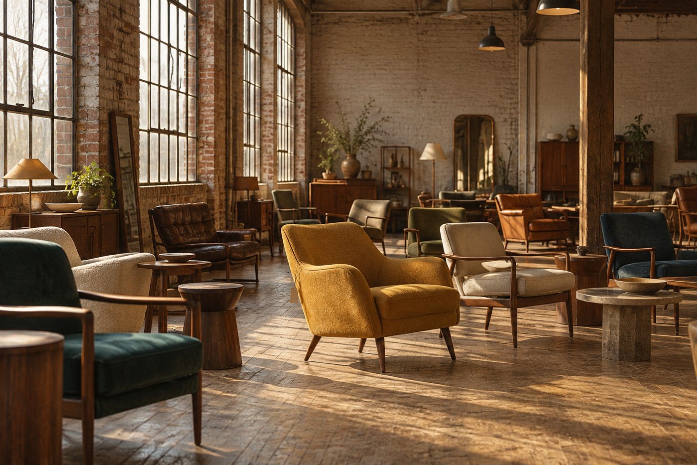
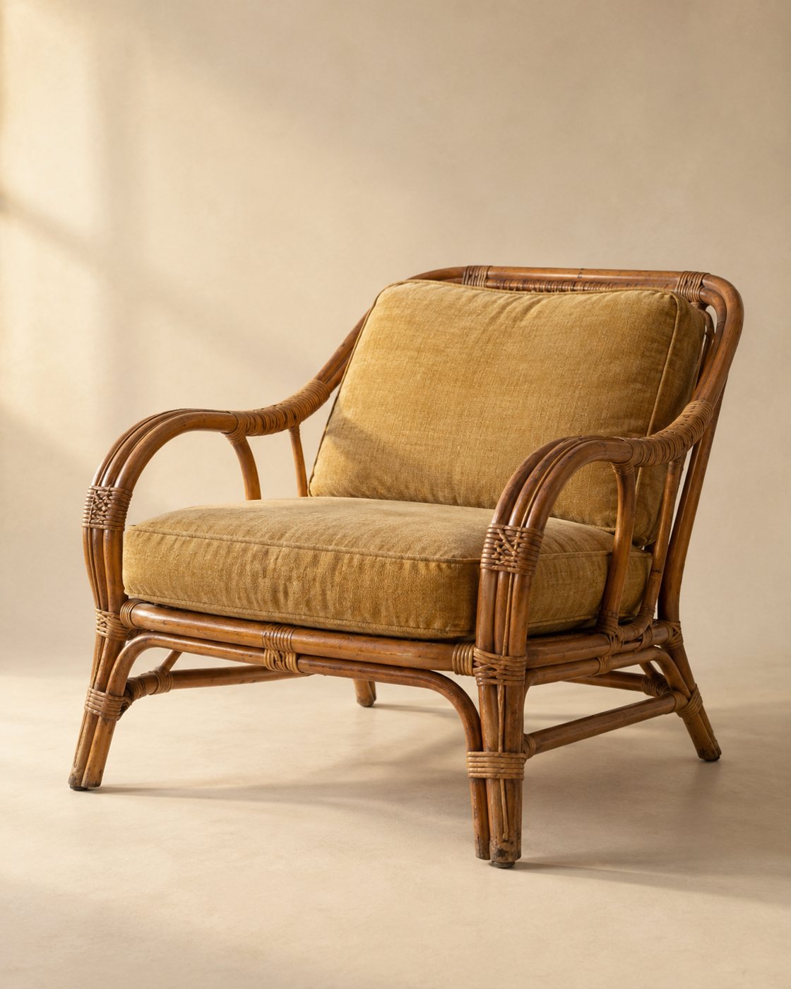
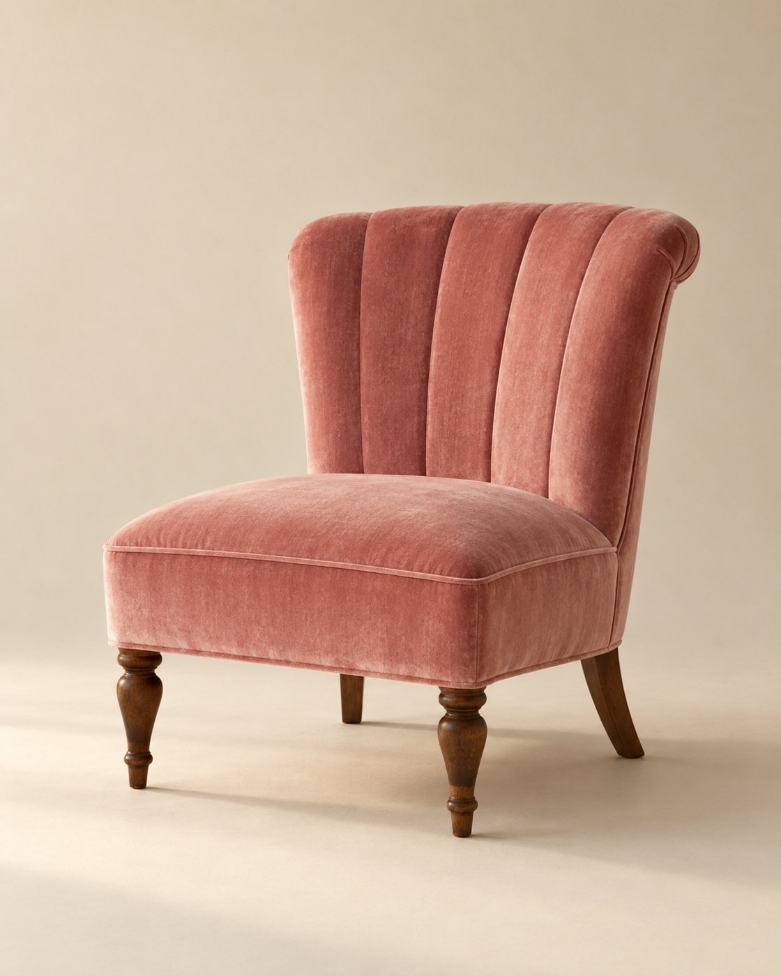
A mustard armchair with a manila price tag against a teal wall

Second Owner

Identity · Spec

A vintage furniture brand built on the price tag, from logo to catalog.

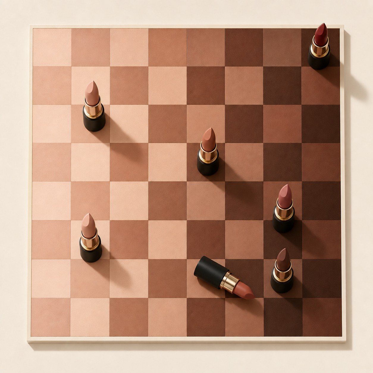
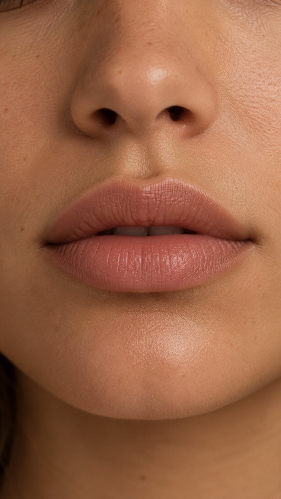
A chessboard of eight nude shades with lipsticks standing on it as pieces

Your move.

Lip · Spec

A nude lip launch where the shade range is a chessboard and every channel is a different game.

Tracings

Posters · Spec

A rink poster series drawn from the patterns skating leaves on the ice.

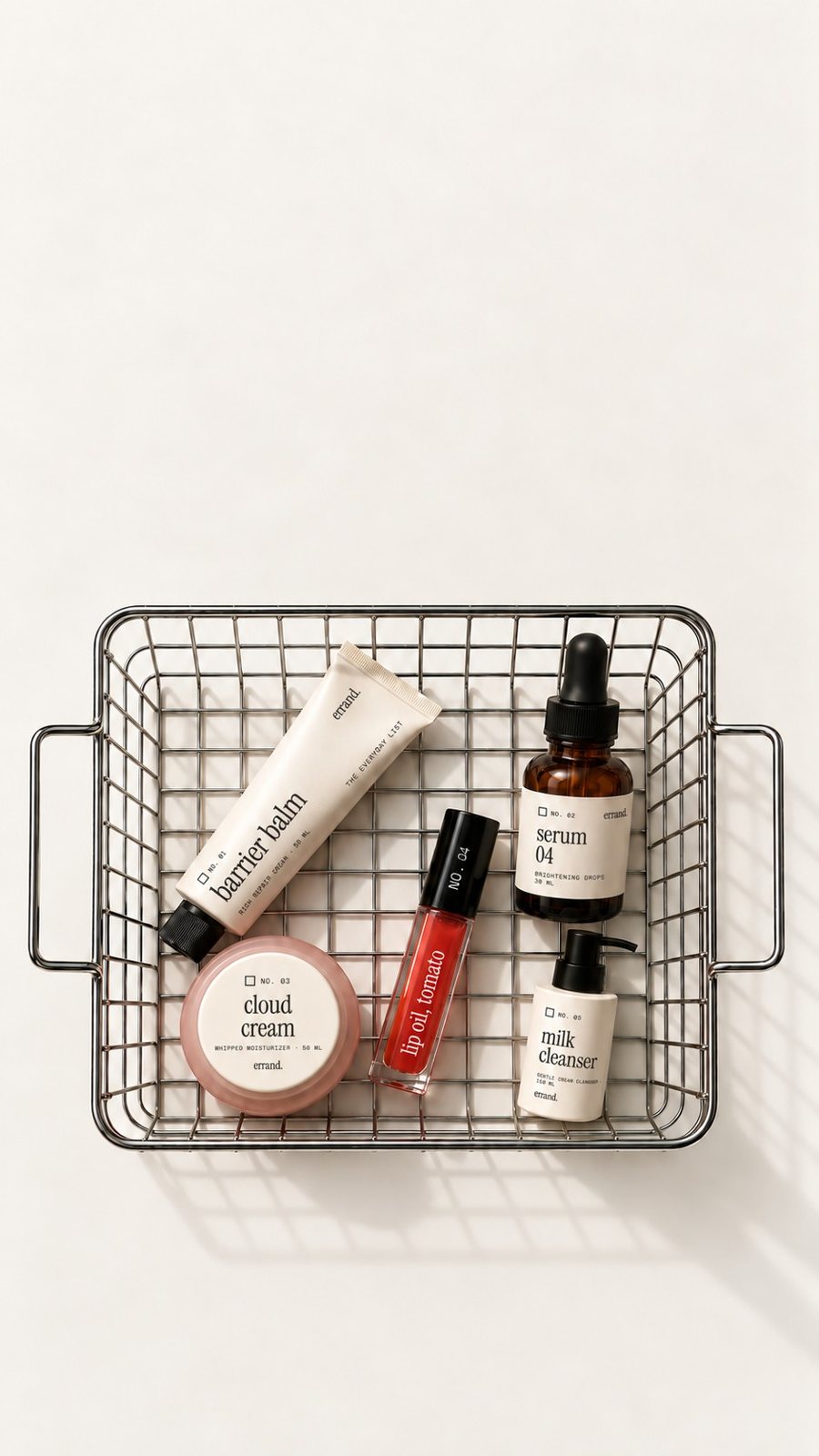
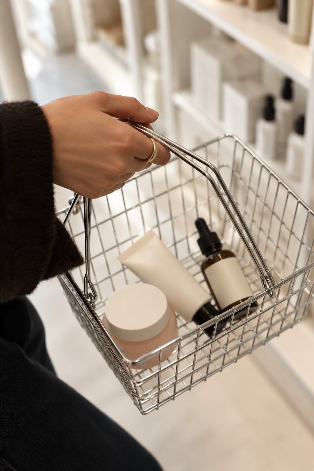
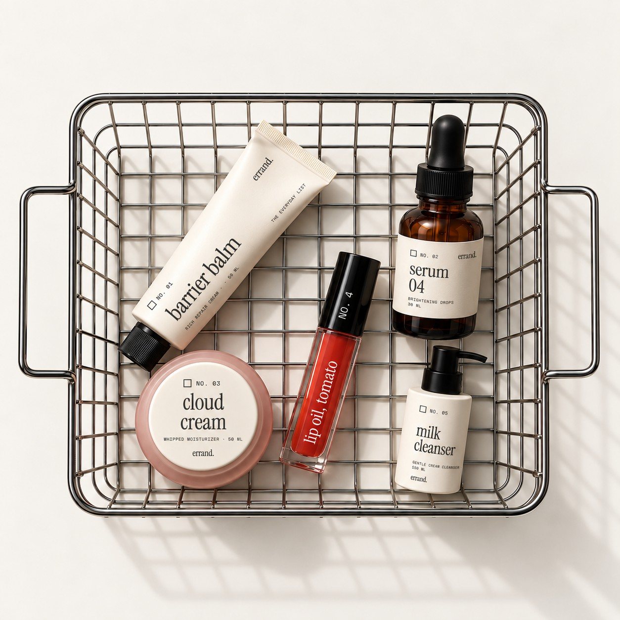
A wire shopping basket holding five labeled errand. skincare products

errand.

Skincare · Spec

An abandoned-cart campaign that treats the cart as a compliment, not a failure.

The lobby is the game.

Dropout · Spec

A scorecard with the rules blacked out, a judges' stamp set and a post-show reveal, for a live comedy tour lobby.

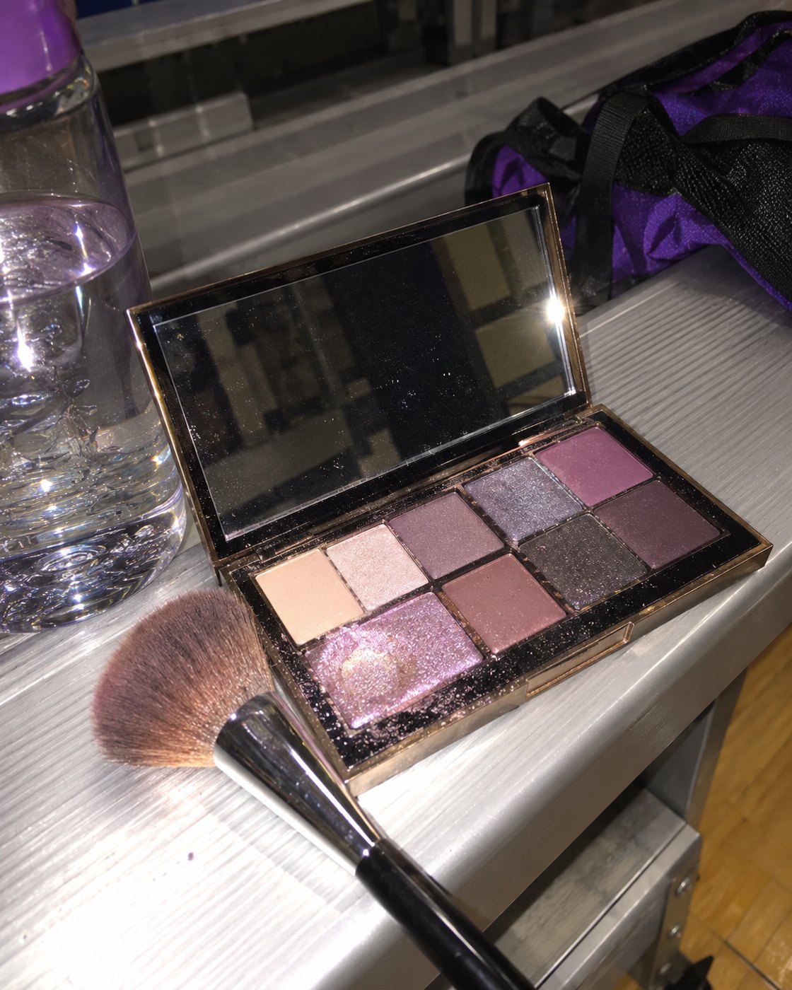
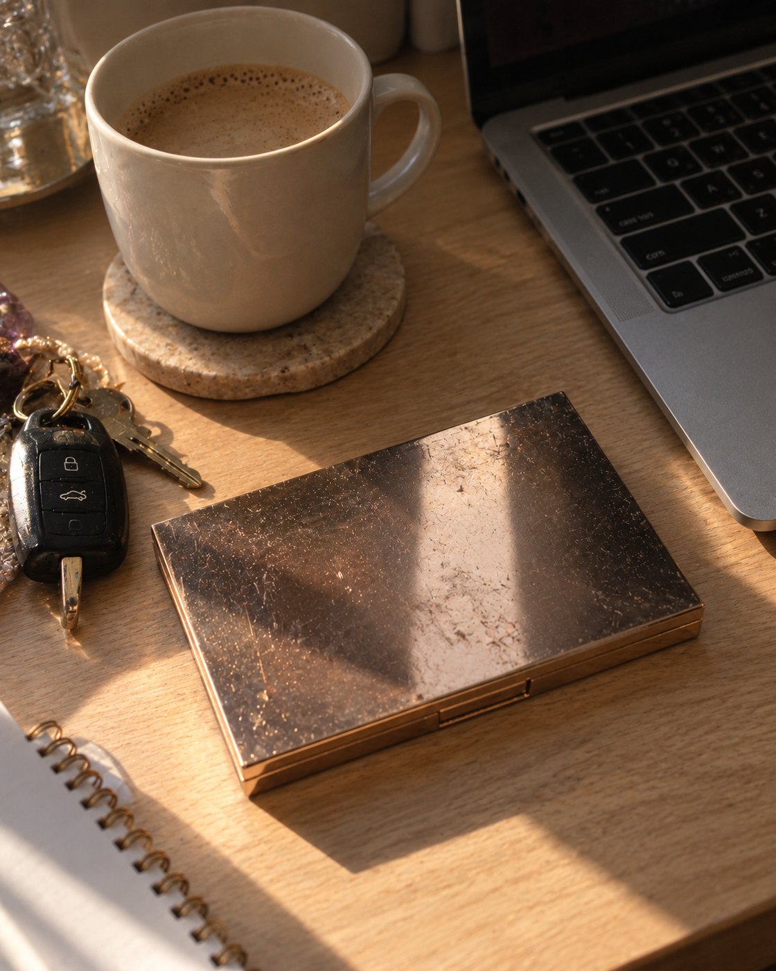
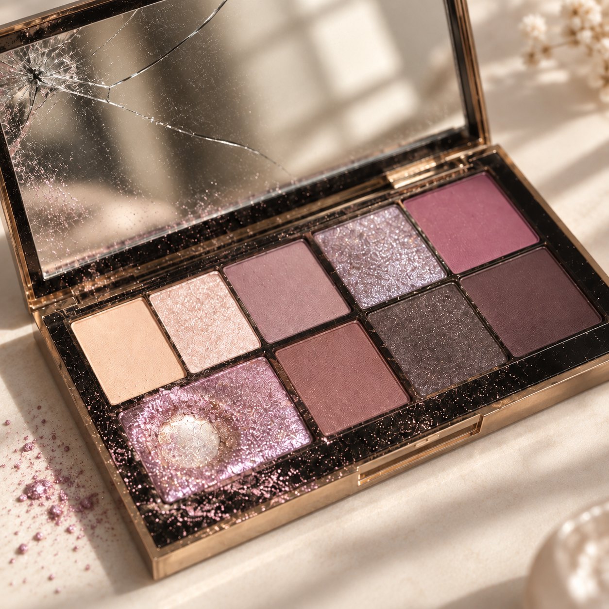
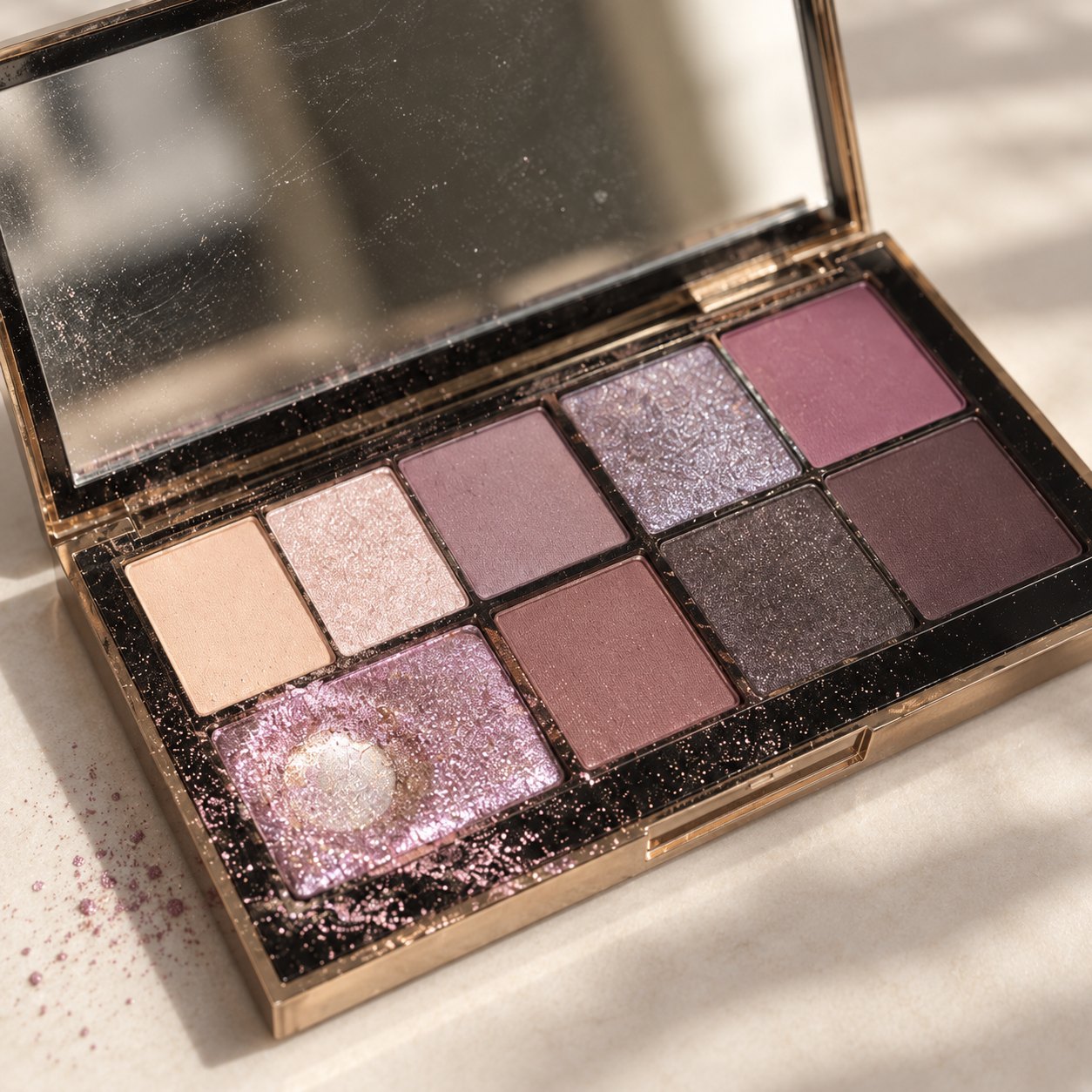
A gold eyeshadow palette with one shade worn to the metal

The palette I kept.

Beauty · Spec

Then and now, told through one palette from three seasons of competitive cheer.

More of what works.

Skincare · Spec

A repeat-type system for a brand built on the things you buy again.

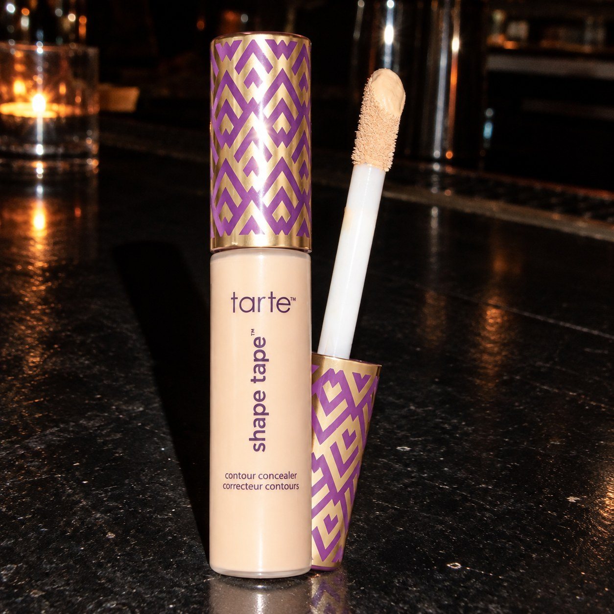
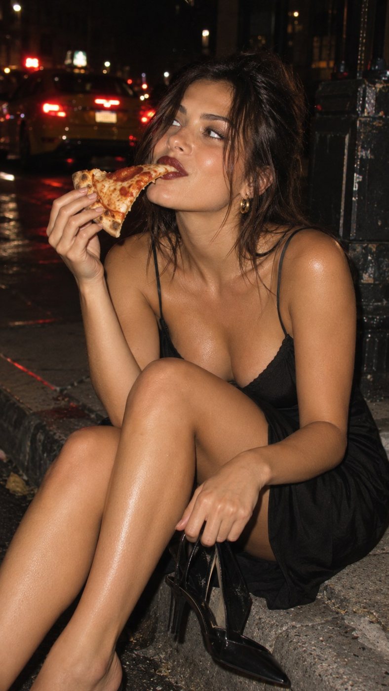
Flash photo of a woman eating pizza on a curb at 2:14 AM

Still on.

tarte · Spec

Long-wear concealer, proven in time-stamped flash photos from one night out.

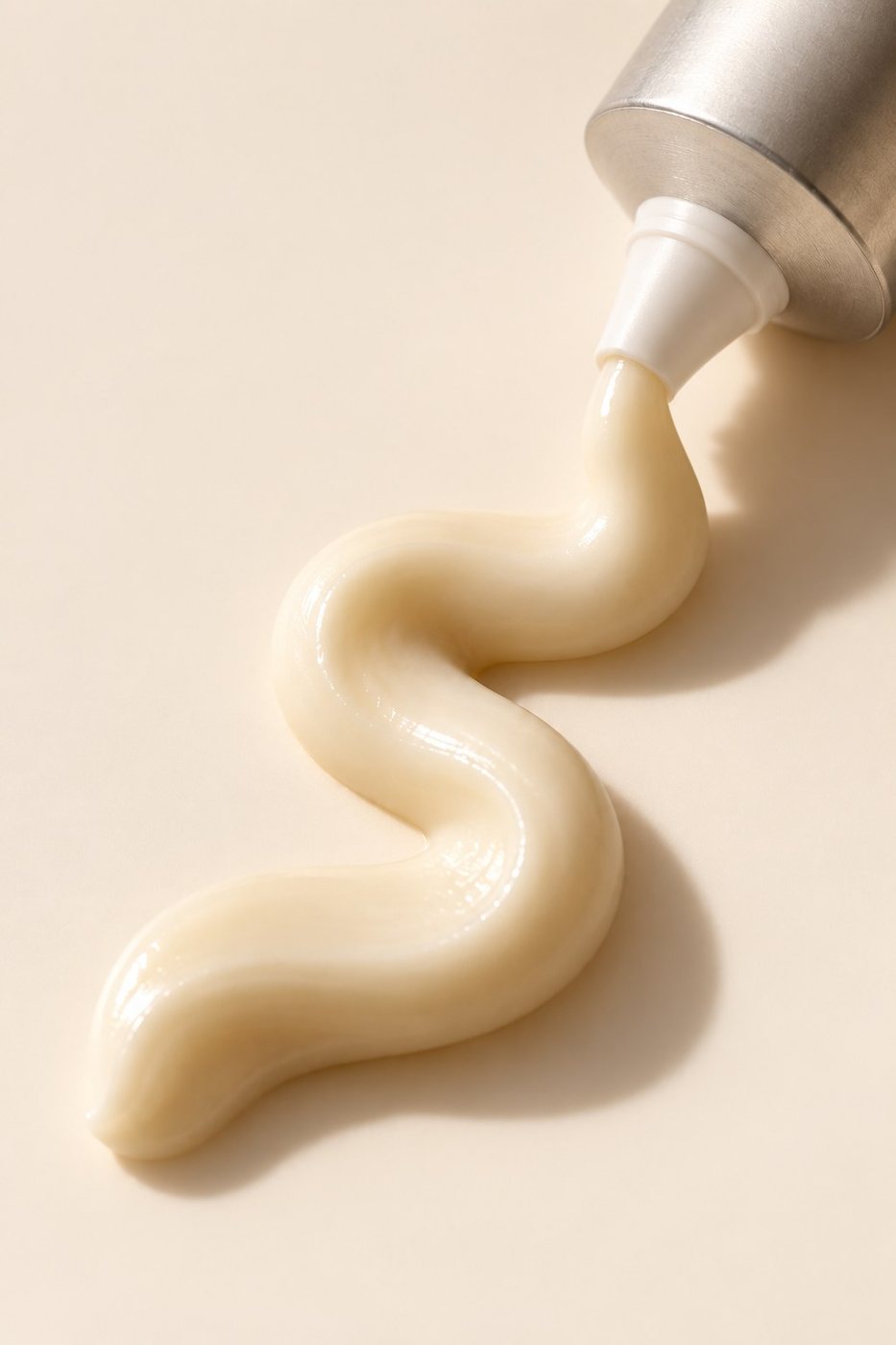
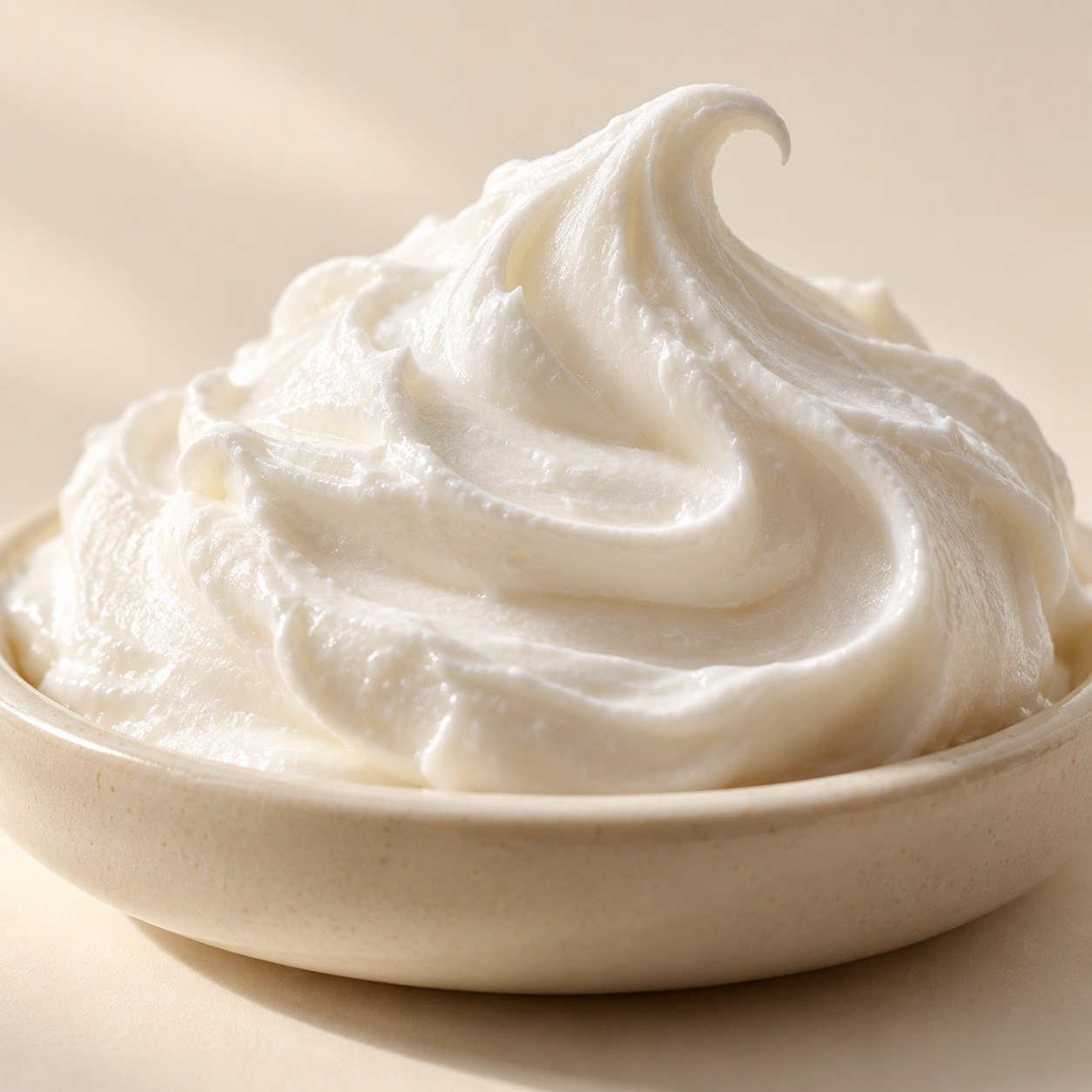
Macro of whipped moisturizer with a curled peak

Proof of texture.

Skincare · Spec

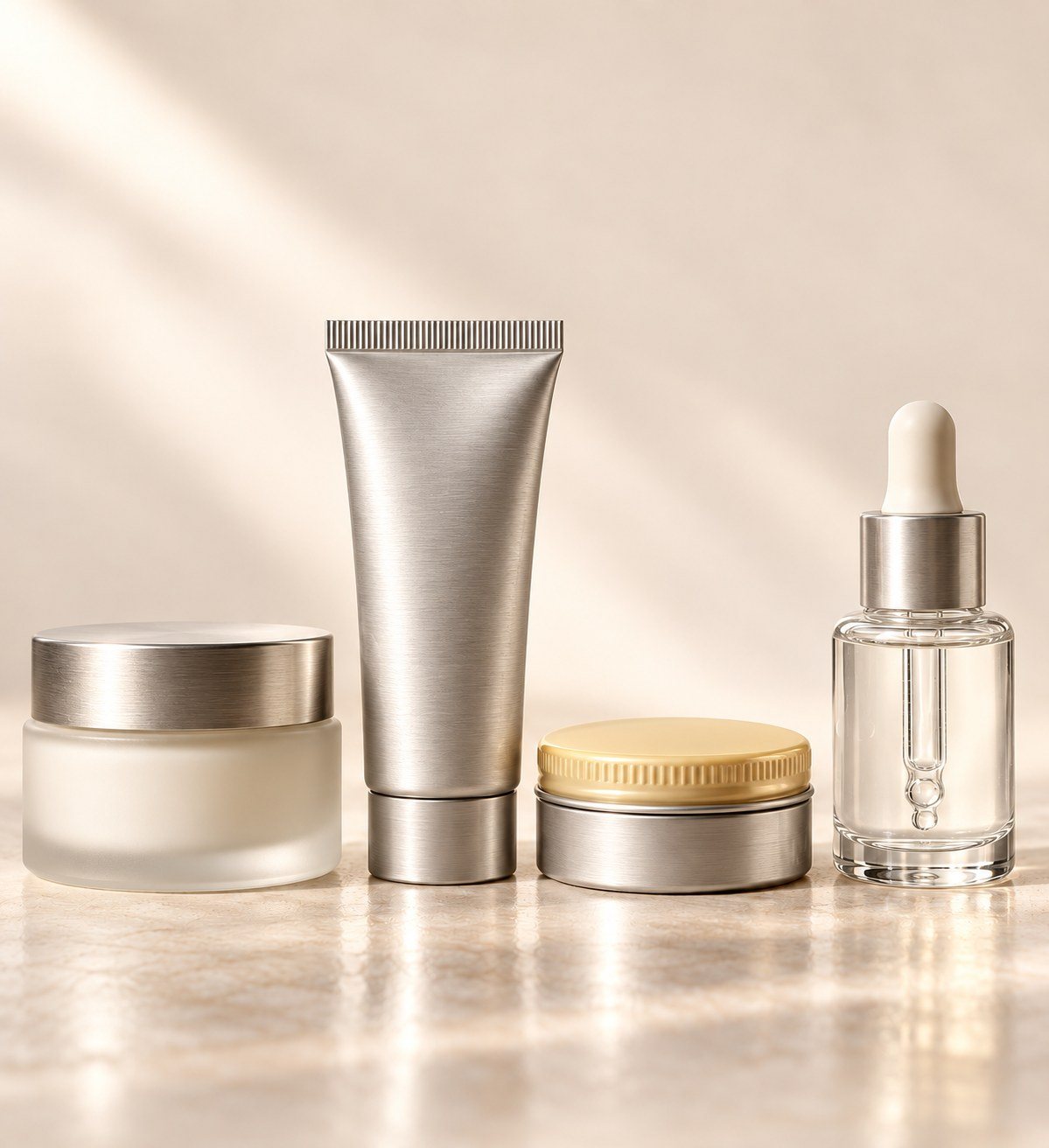
A skincare brand named for kitchen techniques, sold on texture alone.

Motion reel

Motion reel

In progress

Product animation across the campaigns: errand.'s "Checked Out," Still On's flash cut and whisk's texture loops.

Case study 01

Second Owner

A brand identity for a fictional vintage furniture shop in Kansas City's West Bottoms, built on the one thing every piece already has: a price tag.

Type
Self-initiated identity project
Role
Naming, identity, print, editorial, copy
Tools
Claude Design, Photoshop, AI image generation
Deliverables
Logo suite, guidelines, tags, signage, packaging, social, catalog
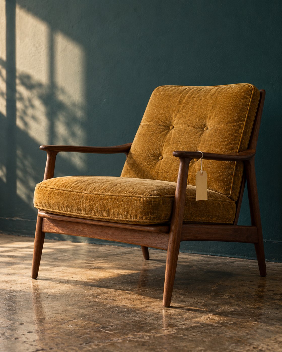
A mustard armchair against a teal wall with a manila tag on its arm

The problem

Vintage shops look the same online: a warm filter, a chair, and "mid-century" in the caption. Nothing tells you why this piece, from this shop, is worth the trip.

The idea

Every piece already had a life. The identity is built on the manila price tag, and every tag says where the thing came from. "PREVIOUSLY: a law office. It has seen things." The voice, the type and the catalog all grow out of that one line.

The identity

Logo suite, type, color and voice

In use

Tags, bag, business cards, blade sign, social, window, packing tape

The catalog

Previously. Issue 01 · cover and three spreads

The tag becomes a caption system. "Previously" becomes the table of contents, a timeline infographic for one chair, and the product grid.

If this ran, I'd measure

Tag photos people share from the shop floor, saves on the weekly "Previously" post, and how often buyers repeat an item's story back at the register. The bet is that a story sells a chair faster than a discount.

Notes

Second Owner is a fictional business. Catalog photography is AI-generated and art-directed; the naming, identity, type system, layouts and copy are mine.
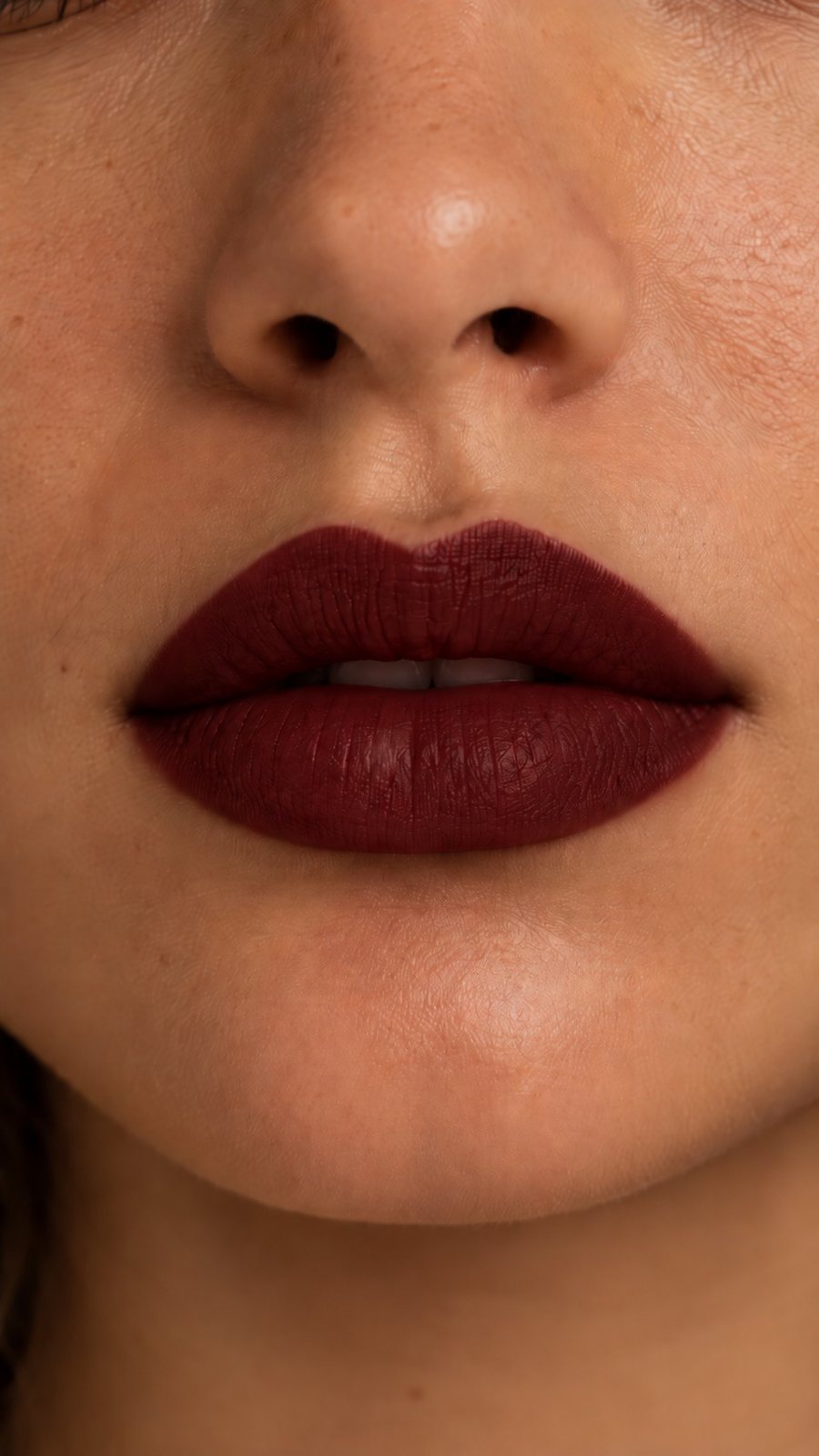
Case study 02

Your move.

A launch campaign for Rank & File, a fictional eight-shade nude lip line where the shade range is a chessboard and every channel is a different game.

Type
Self-initiated spec campaign
Role
Concept, naming, art direction, design, copy
Tools
Claude Design, Canva, AI image generation
Deliverables
Social, carousel, interactive story, launch email
A chessboard of eight nude shades with lipsticks standing on it as pieces

The problem

Nude lip launches all look alike: a row of swatches and a promise about "your perfect nude." Picking one still feels like guessing, and eight similar shades are hard to tell apart in a feed.

The idea

Make choosing a game. The range becomes a chessboard, light to deep, and every shade is named for a square and a move, from A1 Opening to H8 Checkmate, the only red. Then each channel plays a different game: chess, crossword, jigsaw.

The system

A1Opening
B2Castle
C3Pin
D4Fork
E5Gambit
F6En Passant
G7Stalemate
H8Checkmate

The range is the board.Shades run light to deep across the files, so every square in every piece of the campaign is a real product.

One family, all weight.Archivo, condensed and heavy, like board-game packaging. It looks nothing like the soft serif most nude launches reach for.

One red, earned.Checkmate is the only saturated color. It shows up once per piece, always at the end of the move.

The work

Hero post · "Your move."
Story 1 · the missing piece
Story 2 · tap to place
Story 3 · checkmate
Launch email · crossword

The launch email is a crossword. Subject line: "9 letters. Starts with C." The clues are shade names, and 3 across comes pre-filled in red.

The carousel is a field guide. One slide per square: the chess meaning, what the shade does, and when to play it.

1 / 10 · Cover
2 / 10 · A1 Opening
3 / 10 · B2 Castle
4 / 10 · C3 Pin
5 / 10 · D4 Fork
6 / 10 · E5 Gambit
7 / 10 · F6 En Passant
8 / 10 · G7 Stalemate
9 / 10 · H8 Checkmate
10 / 10 · End card

If this ran, I'd measure

Quiz-sticker answers on the story, saves on the carousel (a save is a shortlist), and click-through on the crossword email against a standard launch email. The bet is that giving people something to do beats telling them which nude is theirs.

Notes

Rank & File is a fictional brand. Photography is AI-generated and art-directed; the board system, layouts and copy were designed around it.

Case study 03

Tracings

A winter season poster series for a fictional Kansas City rink, where each poster draws the pattern its session leaves on the ice.

Type
Self-initiated poster series
Role
Concept, illustration, type, layout
Tools
Claude Design, Illustrator
Deliverables
4 posters (24 × 36 in), story, feed posts
The series · Learn to Skate, Public Skate, Freestyle Ice, Winter Exhibition

The problem

Rink posters are clip-art snowflakes and a schedule. Nothing about them looks like skating, and nothing tells a beginner which session is for them.

The idea

Every session leaves a different pattern on the ice: a first figure eight, a crowd's laps, a jump, a step sequence. Draw the pattern, label it like a coach's diagram, and the poster tells you what the session is before you read a word.

Social

Day-of story, weekly schedule, exhibition announcement

The step sequence uses real turn notation: three turns and brackets stay on the curve, rockers and counters change it, with a dashed arc for the rotation.

If this ran, I'd measure

Learn to Skate sign-ups against last season, and schedule-post saves. The bet is that a beginner who can see the figure eight feels like the class is already for them.

Notes

Midtown Figure Club is fictional. No photography: every piece is type and line drawing. I skate, so the turns are drawn the way coaches draw them.

Case study 04

errand.

Your Cart Has Taste: an abandoned-cart campaign for a fictional skincare brand that treats the cart as a compliment, not a failure.

Type
Self-initiated spec campaign
Role
Concept, art direction, design, motion
Tools
Claude Design, Canva, After Effects, AI image generation
Deliverables
Packaging, social, story, email, paid, display, motion
Overhead shot of a wire shopping basket holding five labeled errand. products

The problem

Abandoned-cart emails are some of the most-sent, least-loved marketing in beauty. Most of them sound the same: a small guilt trip and a discount code. Nobody opens one hoping to be told they forgot something.

The idea

Flip the tone. If you picked these five things, you have good taste, and the brand should say so. The whole campaign lives inside the shopping basket: the basket is the hero image, the receipt carries the copy, and a checklist ties the packaging to every ad.

The system

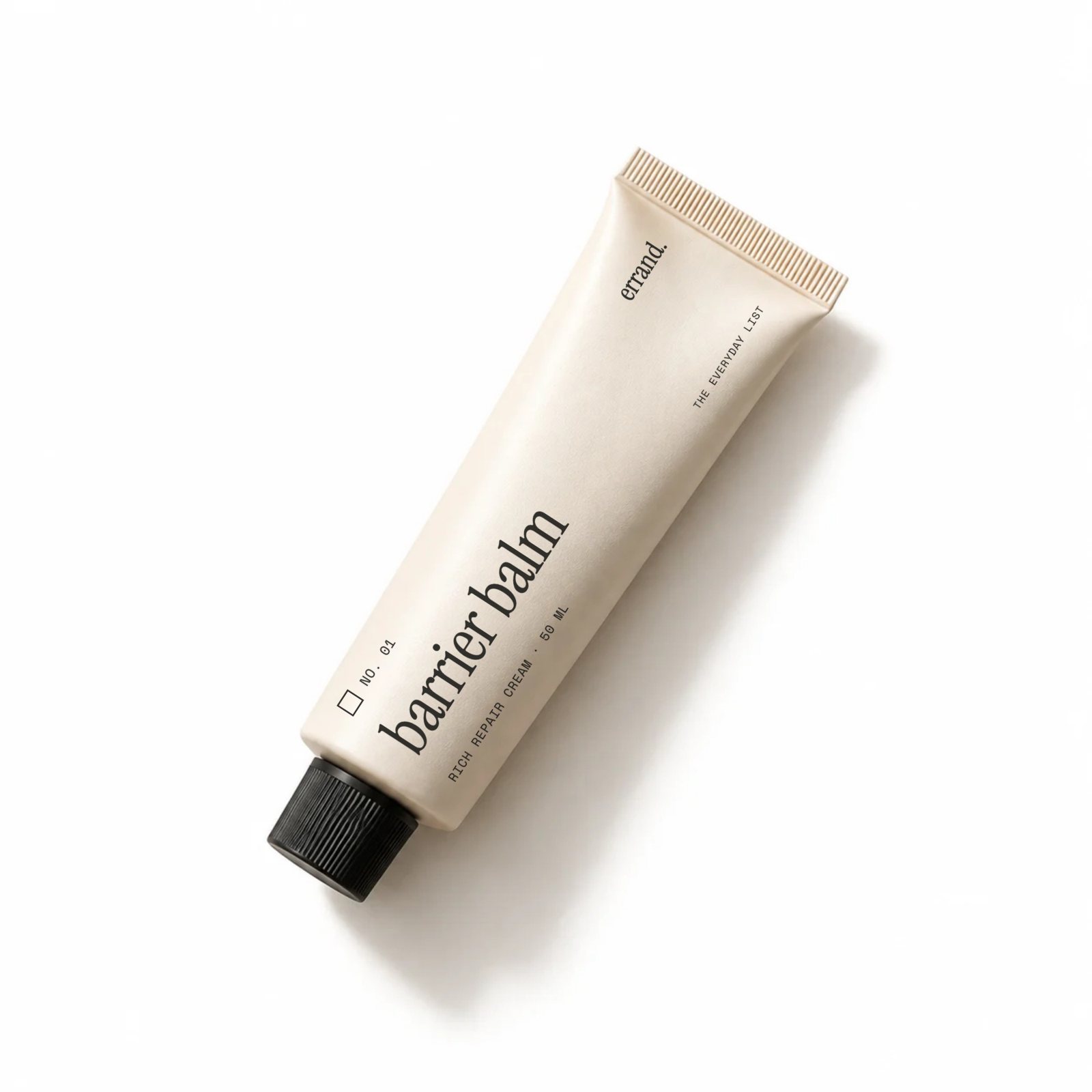
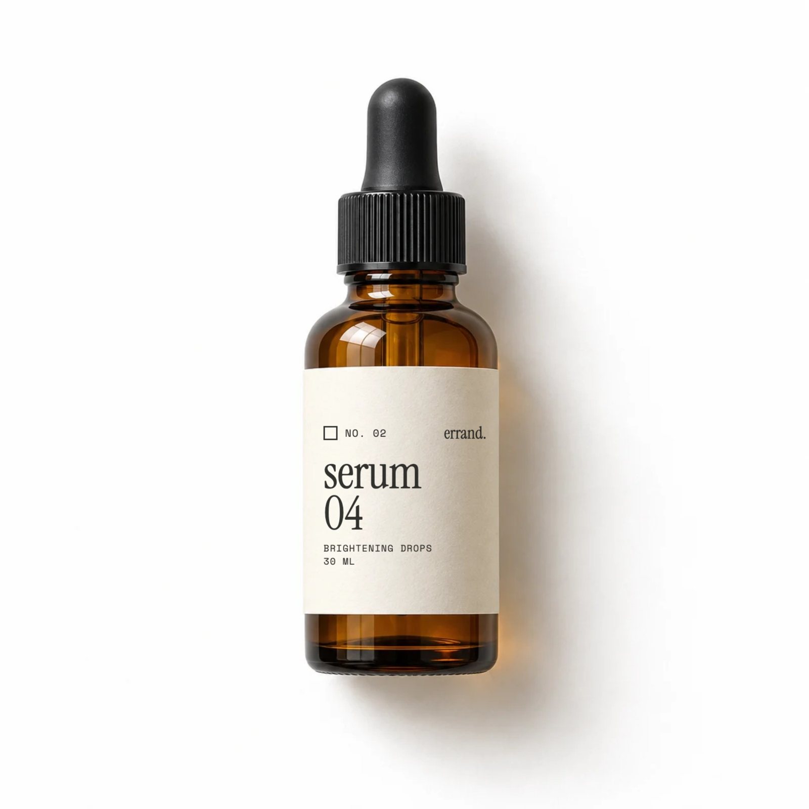
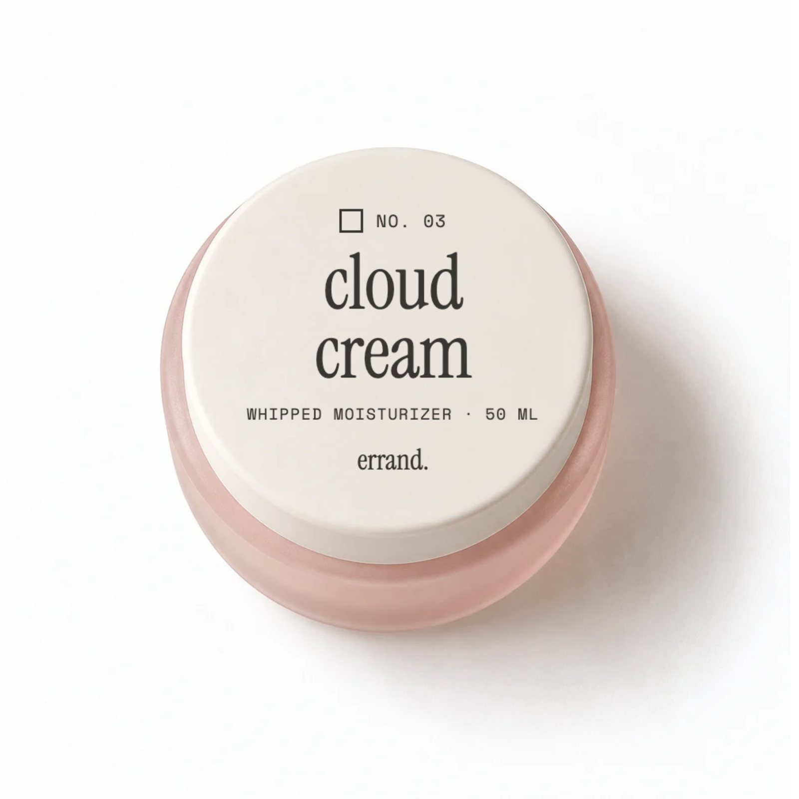
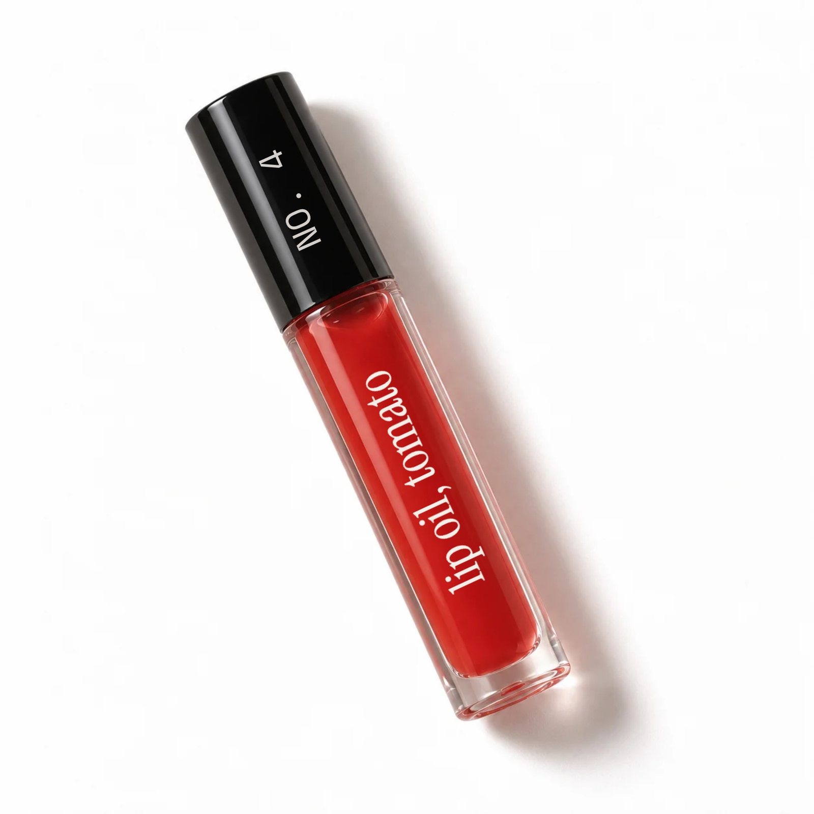
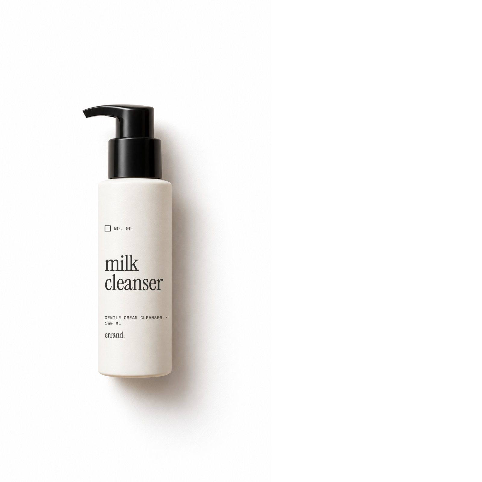
Barrier balm tube Serum 04 dropper bottle Cloud cream jar Tomato lip oil Milk cleanser pump bottle

Every label is a line on a shopping list.An empty checkbox, an item number, the product name, the size. The packaging speaks the same language as the ads.

Two typefaces, one ink.Instrument Serif for names, Space Mono for everything you'd find on a receipt. Warm near-black, never pure black.

Red means checked.Tomato red shows up only when something gets checked off: the tick, the lip oil, the word "taste." Keeping it rare is what makes it land.

The work

Hero post · "Your cart has taste."
Story · "Still in your cart."
Retargeting ad · "Add to cart. Obviously."
Abandoned-cart email
A hand carrying a wire basket of errand. products through a store aisle
Lifestyle
Display set · 728×90, 300×250

The email is where the idea goes deepest. The receipt stops being decoration and becomes the actual item summary, down to a line for "second thoughts: 0." The call to action isn't "complete your purchase." It's "finish the errand."

Animation · 9:16 · 12 s
Export coming soon

Motion

Five products drop into the basket, each faster than the last, and each one gets checked off a list. Then the rhythm breaks: the lip oil hangs in the air for half a second before it falls, and the list clears for one big red check. The receipt prints: total, taste.

Built in After Effects from separated product layers. Loops cleanly for Stories.

If this ran, I'd measure

Cart recovery rate against the brand's current reminder email, clicks on "Finish the errand," and saves on the hero post. The bet is that a compliment converts better than a nudge, without training people to wait for a discount.

Notes

errand. is a fictional brand. Product and lifestyle imagery is AI-generated and art-directed; packaging labels, layouts and motion were designed on top of it.

Case study 05

The lobby is the game.

A spec pre-show activation for Dropout's live tour stops. Every guest gets a scorecard with the rules blacked out, judges roam with rubber stamps, and the secret rule is revealed after the show.

Type
Unsolicited spec work for a real brand
Role
Concept, graphic design, print, copy, experience design
Tools
Claude Design, After Effects
Deliverables
Scorecard, stamp set, lobby screens, reveal posts, lobby plan

The problem

Live comedy fans show up early, often in costume, already wanting to be part of the bit. Then they spend the hour before doors in a merch line. The lobby is the one part of the night nobody designs.

The idea

Game Changer's premise is that you only learn the rules by playing. So the lobby becomes an episode: a scorecard with no readable rules, stations with no instructions, points for a secret rule, and the answer revealed on screen after the show.

The system

INKThe default
CARD STOCKUncoated cream
REVEALOnly once the answer lands
STAMP INKOnly from a judge

Redaction is the graphic.The rules exist; you just can't read them yet. Black bars show up on the card, the screens and the posts.

Ticket-stub type.Bowlby One for the loud part, Barlow Condensed for everything you'd find printed on a ticket.

Yellow means revealed.Everything is ink and cream until the answer lands. Then the screen turns yellow for the first time all night.

Red is only ever ink.It never appears in a layout. It shows up when a judge stamps your card.

The stamps

JUDGE APPROVED · JUDGE APPROVED ·+1The standard point
DOUBLE IT · DOUBLE IT · DOUBLE IT ·×2Fills two boxes at once
NICE TRY · NICE TRY · NICE TRY · NICE ·0Black ink. Still a keepsake.
THAT COUNTS, ACTUALLY · THAT COUNTS ·+1For the loophole finders
JUDGE'SDISCRETIONAnywhere on the card. Worth whatever the judge says.

The stamps carry the jokes. A "0, NICE TRY" in black that people will keep anyway, and a JUDGE'S DISCRETION stamp that makes the scoring feel as arbitrary as the show.

Screens & reveal

Pre-show loop · the rule "has been decided," scoring counts down
Post-show reveal · the only time the screen turns yellow
Reveal post, one per stop

Every city gets its own rule, so every stop gets its own post. It goes up right after curtain, while people are still holding their cards, and teases the next city: "New rule."

The plan

Lobby plan · stations, guest flow, staffing and run of show for a standard theater lobby

Planned from my event production background: a one-way loop through four stations so the lobby never bottlenecks at doors, three roaming judges, a crew of nine, and a prize desk at the exit so the reveal has somewhere to land.

If this ran, I'd measure

How many guests arrive before doors, full cards redeemed at the prize desk, and reach on each stop's reveal post. The bet is that fans who already want to be part of the bit will play if you give them a format.

Notes

Unsolicited spec work, not affiliated with or endorsed by Dropout. The visual system is original: no show logos, graphics or cast likenesses, and no photography. Every piece is type, layout and illustration.

Case study 06

The palette I kept.

A spec campaign for a cult eyeshadow palette, built on a real one: the palette I kept from three seasons of competitive cheer.

Type
Self-initiated spec campaign
Role
Concept, art direction, design, copy
Tools
Claude Design, Photoshop, AI image generation
Deliverables
Carousel, detail graphics, story, landing page
A gold eyeshadow palette with the lilac shimmer worn down to the metal

The problem

Palette launches always sell the new one. But the palette people love most is the one they hit pan on and never threw out.

The idea

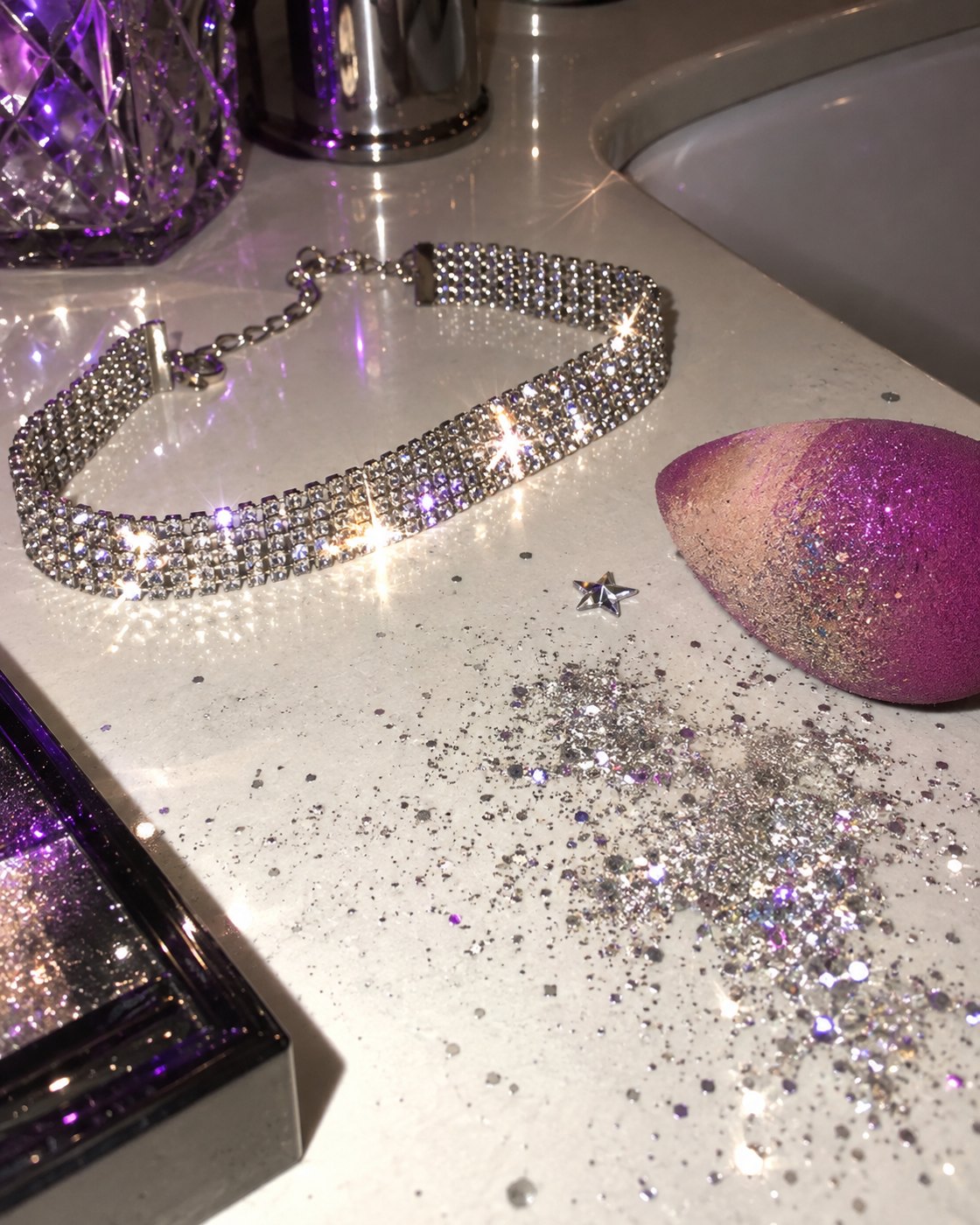
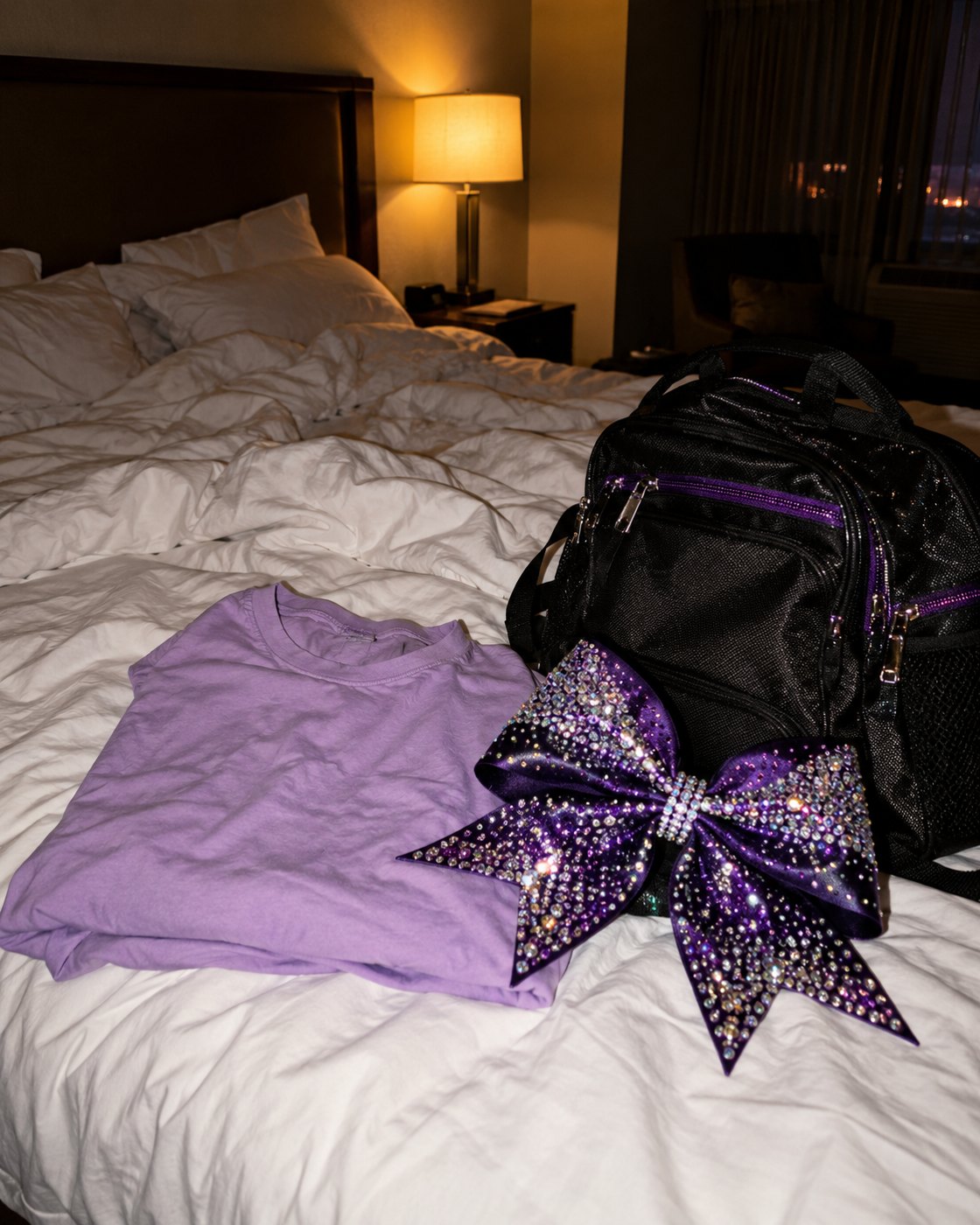
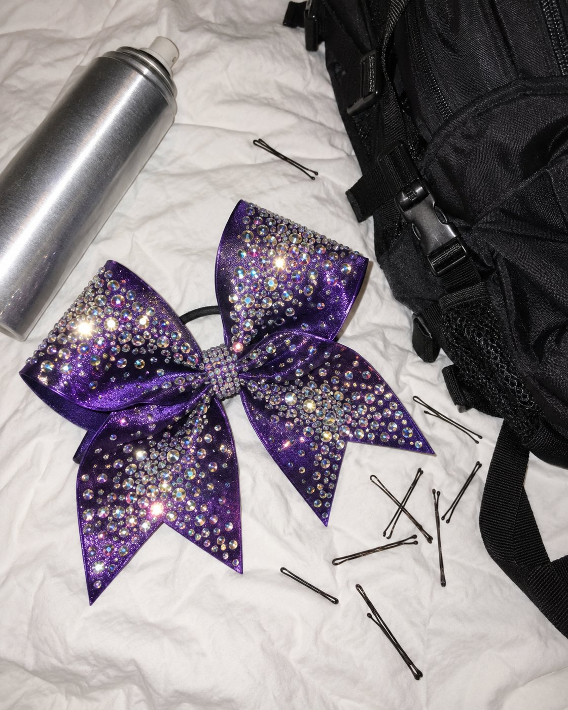
Every piece is a pair. "Then" is varsity type on team purple, hard flash on a rhinestone bow and a bleacher. "Now" is a quiet serif in daylight, one sweep of the same lilac. The palette is the only thing that crosses over.

Then / now

Editorial carousel · 10 slides

The object as evidence

Annotated hit pan, the name on the lid, then/now story

Landing page

"The palette I kept," scrolling from competition season to a Tuesday

If this ran, I'd measure

Hashtag submissions of people's own hit pans, landing page scroll depth, and carousel saves. The bet is that nostalgia with proof beats a new-shade announcement.

Notes

Brand-agnostic spec work. The details are real: my team was Sass, the themes were Sass & Brass, Royal Queens and Royal Guns, and the handwriting is mine. "Then" is told through objects only. Imagery is AI-generated, with my own competition photos used as reference only.

Case study 07

More of what works.

A multi-format system for ditto., a fictional skincare brand built around the things you buy again.

Type
Self-initiated spec campaign
Role
Concept, naming, type system, layout
Tools
Claude Design, After Effects
Deliverables
Hero, story, paid social, display 728×90 and 300×250
The system across five formats

The problem

Replenishment ads are the most forgettable thing a brand makes: a reminder, a discount and a product shot.

The idea

Make repetition the brand. One word repeats in rows (more, again, ditto) until a single band breaks the pattern to show the product. The same rule holds at 728×90 and at full-screen story.

If this ran, I'd measure

Reorder and subscription rate from the refill-day story against a standard reminder, and click-through on the display set. The bet is that the brand becomes the reminder.

Notes

ditto. is a fictional brand. No photography: products are flat illustrations, and every format is built from one layout rule.

Case study 08

Still on.

A spec campaign for tarte Shape Tape that proves long wear the way people actually check it: in flash photos from the night.

Type
Unsolicited spec work for a real brand
Role
Concept, art direction, copy, motion, experiential
Tools
Claude Design, Canva, After Effects, AI image generation
Deliverables
Carousel, 6 s motion cut, venue activation
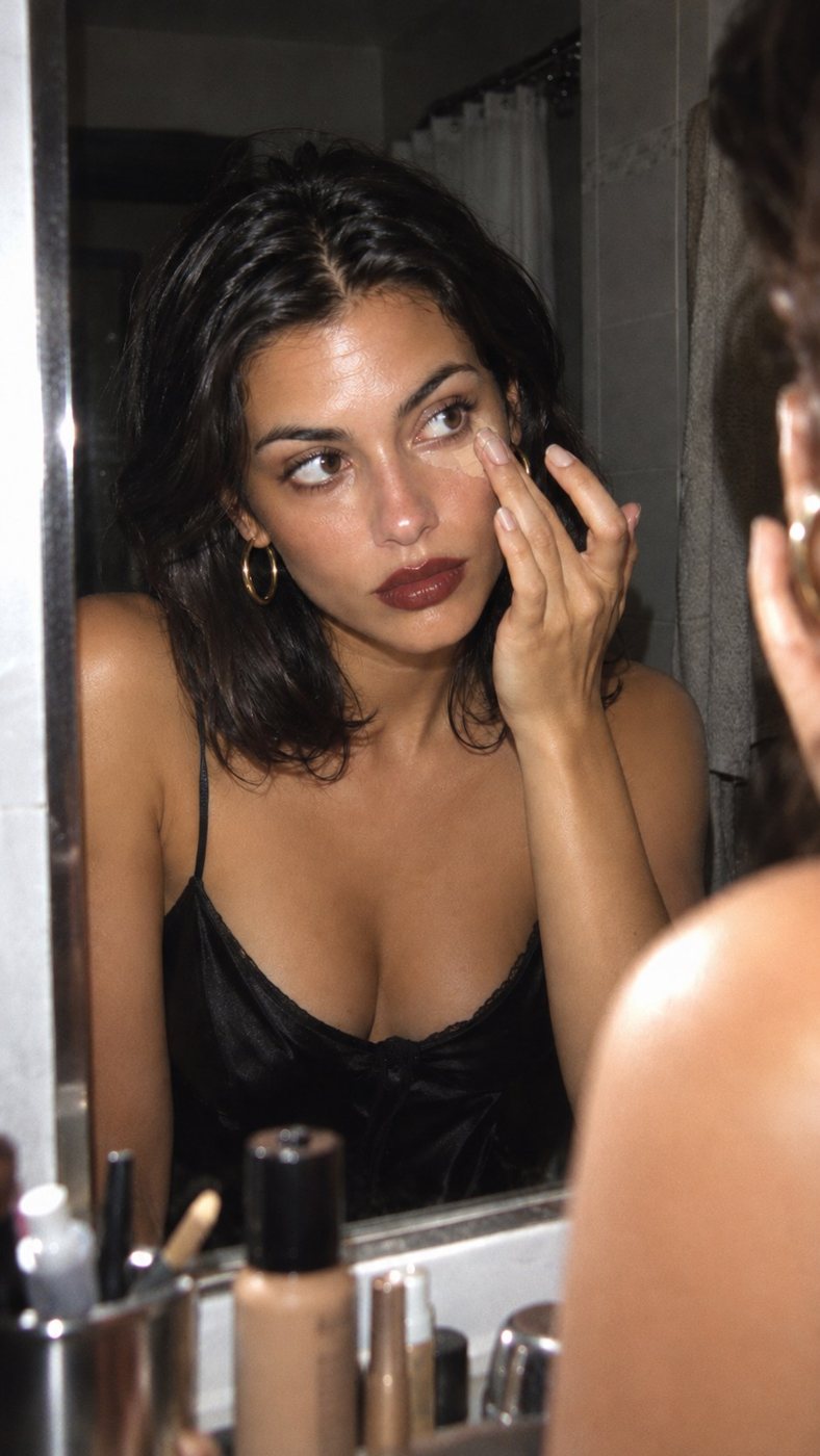
Getting ready in the mirror9:47 PM
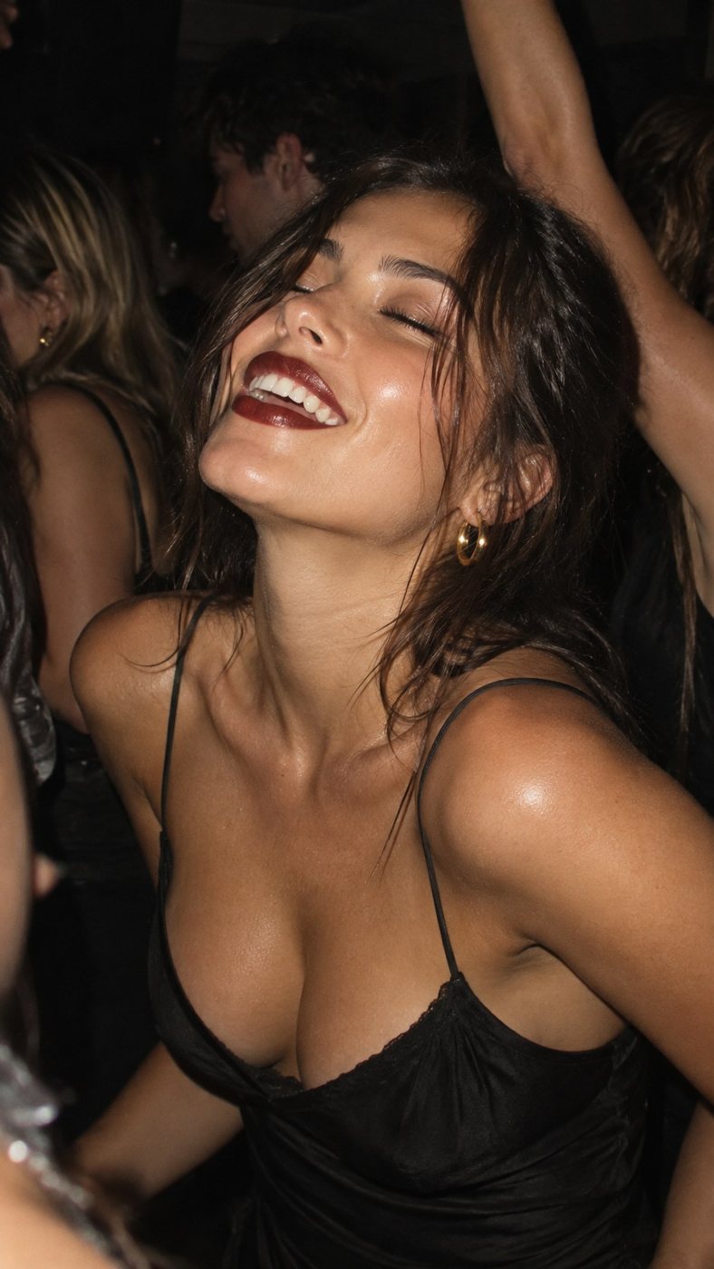
Laughing on the dance floor11:58 PM
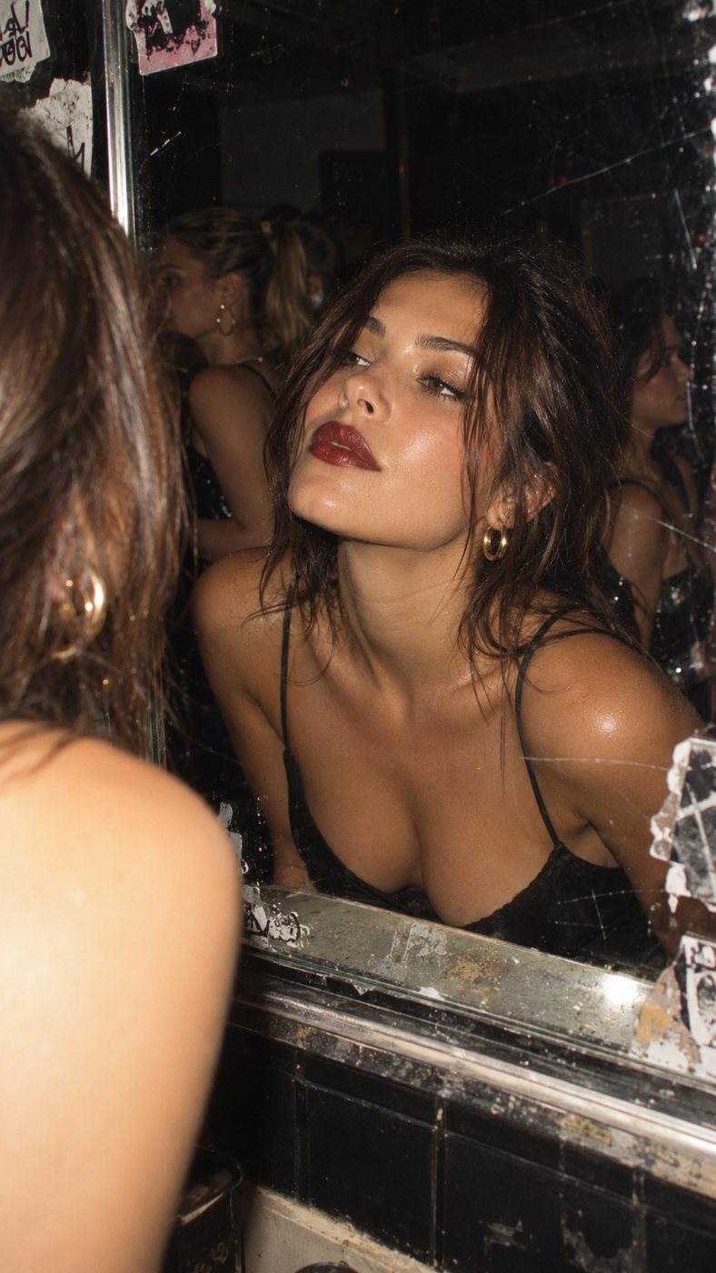
Checking her face in a venue bathroom mirror1:30 AM
Eating pizza on a curb2:14 AM

The problem

Every concealer says it lasts. The claim is printed on the tube and repeated in every ad, and nobody believes a number. What people trust is how their face looks in the photos their friends post the next day.

The idea

Follow one night in flash photos, each stamped with the time like an old point-and-shoot. 9:47 PM, applied. 2:14 AM, still on. The hour changes and the face doesn't, so the product proves itself without a claim.

The system

The date stamp is the proof.Camera-orange time in the corner of every frame. Orange only ever means time.

Direct flash, real skin.Blown highlights, black falloff, visible texture. The least forgiving light there is, on purpose.

The joke is the rhythm."Still on." three times in a row, then 9:02 AM: "Okay, now take it off."

The work

1 / 7 · Cover
2 / 7 · 9:47 PM
3 / 7 · 11:58 PM
4 / 7 · 1:30 AM
5 / 7 · 2:14 AM
6 / 7 · 9:02 AM
7 / 7 · End card

Carousel, 7 slides · swipe = time passing

6 s motion cut · 9:16
Export coming soon

Motion

Every cut is a camera flash: two white frames, then the next photo. The date stamp doesn't cut with the image. It counts up through each flash, so time races while her face stays the same. The only soft transition is the warm fade into 9:02 AM.

10:12 PM
10:13 PM
CHECK IN
1:48 AM
1:49 AM
CHECK OUT

Activation: the Proof Booth

A flash photo booth in venue bathroom lounges, where the mirror check already happens. One strip when you arrive, one before you leave, both time-stamped. Guests go home with dated before-and-after proof and a shade match from the touch-up bar next to it.

Planned from my event production background: footprint, staffing and guest flow sized to fit a lounge corner.

If this ran, I'd measure

Booth return rate, since check-in to check-out is the real product proof. Shade matches made, strips shared, and watch-through on the 6-second cut.

Notes

Unsolicited spec work, not affiliated with or endorsed by tarte. Photography is AI-generated and art-directed; the product shot is a placeholder until replaced with a real photo.

Case study 09

Proof of texture.

A launch campaign for whisk, a fictional skincare brand built on kitchen techniques, where every ad is the product's texture doing exactly what its name says.

Type
Self-initiated spec campaign
Role
Concept, naming, art direction, design, motion
Tools
Claude Design, Canva, After Effects, AI image and video generation
Deliverables
Social series, product page, texture loops
Macro of whipped moisturizer with a curled peak

The problem

Skincare ads sell the jar. But the first thing people ask in reviews and comments is what a product actually feels like, and a jar can't answer that. Texture is the one thing a close-up can't fake.

The idea

Borrow the kitchen. Each product is named for how it's made (Whipped, Churned, Folded, Piped), and every ad is a macro of that technique, annotated like a lab notebook. The annotations replace the claims list.

The system

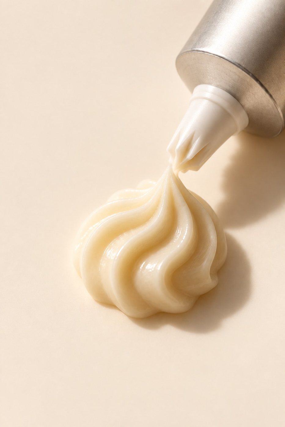
Whipped moisturizerFIG. 01Whipped
Moisturizer
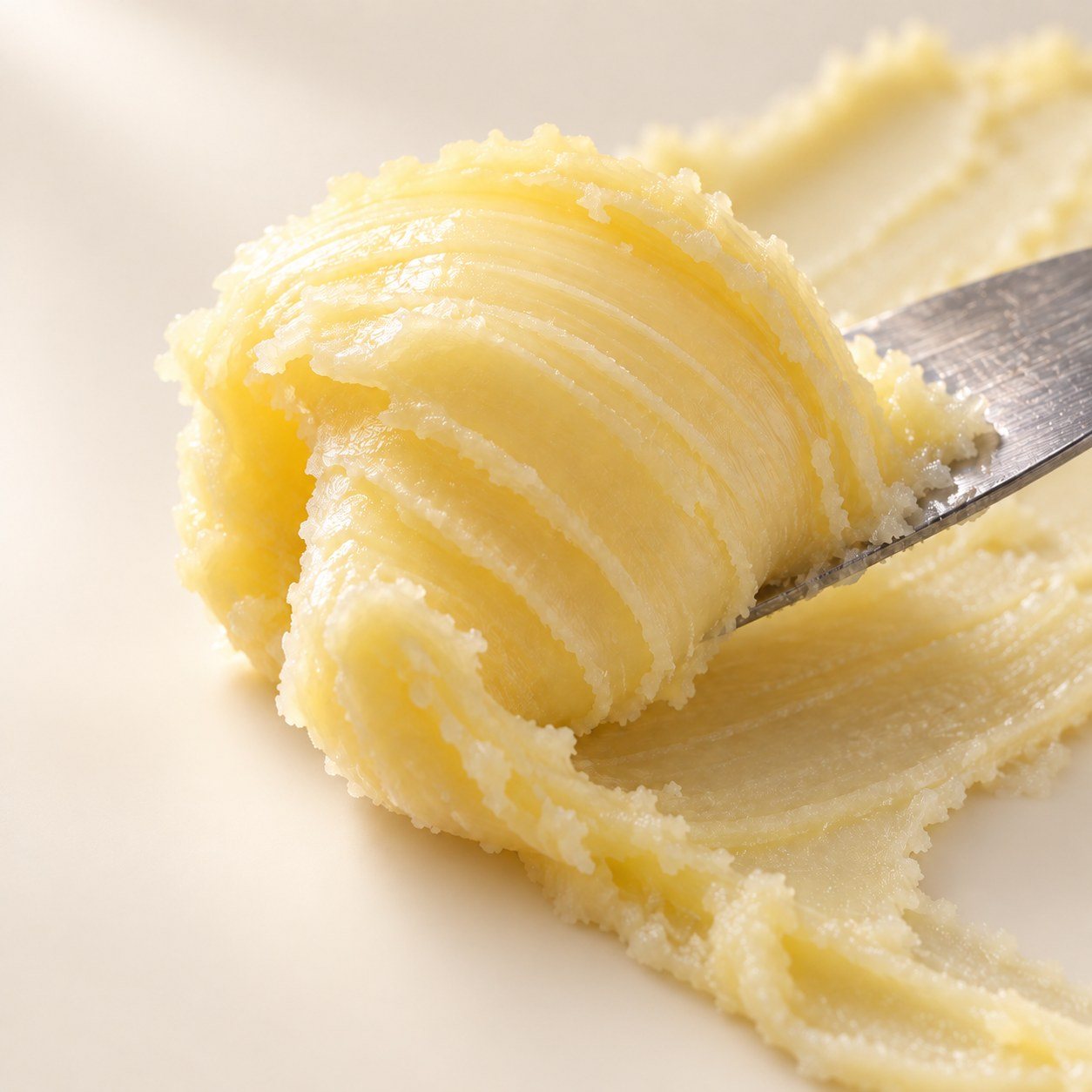
Churned cleansing balmFIG. 02Churned
Cleansing balm
Folded gel serumFIG. 03Folded
Gel serum
Piped eye cream rosetteFIG. 04Piped
Eye cream

The name is the technique.No ingredient-led names. You know what Whipped feels like before you read a word.

Macro fills, type stays small.Gloock for names, IBM Plex Mono for every annotation, pinned with a dot and a hairline.

One warm note.Cream ground, cocoa ink, and butter yellow as the only accent.

The work

Whipped
Churned
Folded
Piped
The range

Social series · one technique per post, plus the range

Product page · lettered callouts on the macro instead of a claims list
Texture loops · 9:16 · 4 s
Export coming soon

Motion

Four seamless 4-second loops, one per technique. AI image-to-video gave me raw motion for Whipped and Churned; I looped, graded and annotated them in After Effects, and built Folded and Piped from stills with scale and displacement so all four move as a set.

If this ran, I'd measure

Product-page conversion with the annotated macro against a standard jar shot, saves on the social series, and watch-through on the loops. The bet is that showing texture answers the question a claims list can't.

Notes

whisk is a fictional brand. Stills and raw video are AI-generated and art-directed; naming, the annotation system, layouts and motion finishing are mine.

About

I studied Communication and Media Studies at Northeastern and have spent my career so far in events, entertainment marketing and operations. I've been teaching myself motion design since 2019.

I like work where logistics and creative thinking meet: an idea is only as good as how it holds up across every place it has to show up. These spec campaigns are how I practice that.